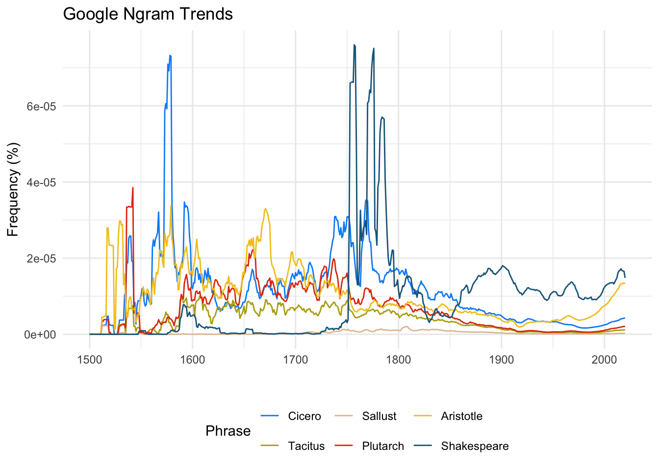
words <- c("Cicero", "Tacitus", "Sallust","Plutarch", "Aristotle", "Shakespeare", "Milton")

df <- map_dfr(words, ~ngram(.x, corpus = "eng_gb_2019", year_start = 1500, year_end = 2020))

df |>
  ggplot(aes(x = Year, y = Frequency, color = Phrase)) +
  geom_line() +
  scale_color_paletteer_d("ggthemr::solarized") +
  theme_minimal() +
  theme(legend.position = "bottom") +
  labs(title = "Google Ngram Trends", y = "Frequency (%)", x = "")